UI Toolkit at runtime: Get the breakdown


UI Toolkit is a collection of features, resources, and tools made for developing user interfaces and Editor extensions. First introduced as UI Elements, UI Toolkit offers a retained-mode UI framework to facilitate the development of custom UI for Unity Editor extensions.
Available in the latest version of Unity, UI Toolkit supports the creation of runtime UI through a familiar and intuitive authoring experience, inspired by web technologies. This article examines the specificity of its capabilities and shares tips for getting started with UI Toolkit at runtime as an alternative to UGUI.
Check out this manual for an in-depth comparison between UI systems.
Getting started in Unity
Unity 2021 LTS is now available to download and use. This release represents more than a year of focused development across the entire Unity Editor plus underlying foundational features, combined with the features included in our Unity 2021.1 and Unity 2021.2 Tech Stream releases (with an additional six months of quality polish).
To get started, download the latest version of Unity from the Unity Hub.

Workflow
Let’s clarify how UI Toolkit can ensure smoother workflows while creating UI.
Creating UI in collaboration with artists can be a complex task. While the artist is editing the Canvas to add colors and material, the developer adds scripts, behaviors, and OnClick listeners. Afterward, when merging occurs, merge conflicts can arise and lead to issues that require swift resolution.
UI Toolkit prevents such merge conflicts by having the artist work on the UXML and USS files while C# handles all of the logic. For example, button handling is done with C# only, which queries the button using its name, and adds logic without editing any UXML or USS files.
Not only does this process ease merging, it simplifies future style changes. For instance, if all project fonts suddenly had to be changed, you wouldn’t need to go through each asset, one by one, to edit the text settings. This avoids tedious work that can lead to oversight issues – and the bigger the game, the more complicated this becomes.
With UI Toolkit, Panel Settings hold all of the text settings. So to change the fonts under a UI Document, you only need to edit those Panel Settings. Although Editor scripts can similarly assist with UGUI, UI Toolkit’s framework automatically handles this process.
A Visual Element is the base class of every UI Toolkit element: buttons, images, text, etc. You can think of it as the GameObject of UI Toolkit. Meanwhile, UI Builder (Window > UI Toolkit > UI Builder) is a visual tool that helps create and edit interfaces without writing code. This is useful for artists and designers alike, as it allows them to visualize the UI as it’s being built.
As the premiere tool for people already familiar with web technologies, UI Toolkit also improves collaboration between artists and developers by separating logic and style to refine organization and avoid file conflicts. While UI Builder takes care of the elements’ positions, style, and design, code can be handled in a distinct section of the project to query the parts of UXML that it needs, and connect logic to it.
Getting started with UXML
UXML files are comparable to HTML web files. They represent visual elements and contain the hierarchy of the UI. Create a UXML document via Assets > Create > UI Toolkit > UI Document. Then use UI Builder to visualize and work on the newly created UXML.

Note, however, that a UXML file should not be treated as a GameObject, but rather as a tree of visual elements. To lighten up the hierarchy, harness a single UI Document and load all UXML elements on it. You can visualize the UI with UI Toolkit Debugger under Windows > UI Toolkit > Debugger.

To help you get started, take a look at some UXML Element examples from Windows > UI Toolkit > Samples.
Thanks to UI Builder, UXML files can be created, visualized, and tested without launching the game. Just drag and drop UI controls (standard or user-made) into the hierarchy from the UI Builder Library panel, and combine multiple UXML files to create the final UI.
Let’s say we have a UI composed of three elements:
- Health
- Score
- “You win” pop-up
The “You win” pop-up will display Health, Score, as well as a Restart button.
Each element is used in a different UI panel of the game, as they are part of separate UXML files with popup.uxml – a combination of health.uxml and score.uxml plus the Restart button. As such, the code logic managing the score and the health (score.cs and health.cs) are independent of the hierarchy. This means that health.cs will always update health.uxml values, whether the UI is displayed alone onscreen or inside another pop-up.
Combining UXML can also facilitate the visualization of edited objects. By turning on the Class List option within the UI Builder hierarchy, you can see what is impacting the object at first glance, and use selectors to keep the style organized:

Another benefit concerns the Scene hierarchy. Instead of having a single Canvas with dozens of GameObjects, UI Toolkit only needs one UXML file linked to a UI Document.


This workflow is particularly advantageous for larger teams. Instead of working on the same scene, with the possible risk of merge issues, each team member can work on their own UXML files, which are then added to a single UI Document within the scene.
Panel settings
The Panel Settings Asset (Assets > Create > UI Toolkit > Panel Settings Asset) defines how the UXML is going to be instantiated and visualized within the game. It’s possible to have multiple Panel Settings Assets to enable different styles for the UIs. For example, employing certain Panel Settings for the HUD and others for the Minimap makes sense, as these are very different UIs with distinct needs.
Panel Settings can be seen as a UGUI Canvas + Canvas Scaler with additional options like text settings, so that all text inside the panel uses the same base setting. This avoids time spent manually resetting each font – but of course, fonts can still be overridden inside the individual UI Documents, as needed.

Events
UI Builder is not meant for event management, nor is the UXML document. To handle a button-click or any other event, create a C# Script and link it to the UXML.

public class UIEventHandler : MonoBehaviour
{
   [SerializeField]
   private UIDocument m_UIDocument;

   private Label m_Label;
   private int m_ButtonClickCount = 0;
   private Toggle m_Toggle;
   private Button m_Button;

   public void Start()
   {
       var rootElement = m_UIDocument.rootVisualElement;

       // This searches for the VisualElement Button named “EventButton”
       // rootElement.Query<> and rootElement.Q<> can both be used
       m_Button = rootElement.Q<Button>("EventButton");

       // Elements with no values like Buttons can register callBacks
// with clickable.clicked
       m_Button.clickable.clicked += OnButtonClicked;

       // This searches for the VisualElement Toggle named “ColorToggle”
       m_Toggle = rootElement.Query<Toggle>("ColorToggle");

       // Elements with changing values: toggle, TextField, etc...
// implement the INotifyValueChanged interface,
       // meaning they use RegisterValueChangedCallback and
// UnRegisterValueChangedCallback
       m_Toggle.RegisterValueChangedCallback(OnToggleValueChanged);

       // Cache the reference to the Label since we will access it repeatedly.
       // This avoids the relatively costly VisualElement search each time we update
       // the label.
       m_Label = rootElement.Q<Label>("IncrementLabel");
       m_Label.text = m_ButtonClickCount.ToString();
   }

   private void OnDestroy()
   {
       m_Button.clickable.clicked -= OnClicked;
       m_Toggle.UnregisterValueChangedCallback(OnToggleValueChanged);
   }

   private void OnButtonClicked()
   {
       m_ButtonClickCount++;
       m_Label.text = m_ButtonClickCount.ToString();
   }

   private void OnToggleValueChanged(ChangeEvent<bool> evt)
   {
       Debug.Log("New toggle value is: " + evt.newValue);
   }
}
Positioning
Element positioning uses the Flexbox architecture by default. This ensures that most layouts are responsive to container or screen size. Apply it to a Visual Element Tree with two or more elements, then define how they align on the tree.
Placing an element in Absolute positioning means that it will be situated relative to its parents’ positioning, and won’t affect or be affected by any other positions.
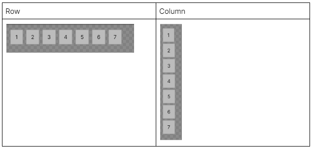
For the Flex and Align settings, use this simple hierarchy as an example:

Edit the the following settings using the UI Builder Inspector:

- Basis: This refers to the default size of the item, before any Shink (shrink ratio if the parent has no size left) or Grow (grow element ratio if size is left in the parent) operation occurs.
- Direction (Row and Column): Use this to create behaviors similar to UGUI’s Vertical Layout Group and Horizontal Layout Group, respectively.

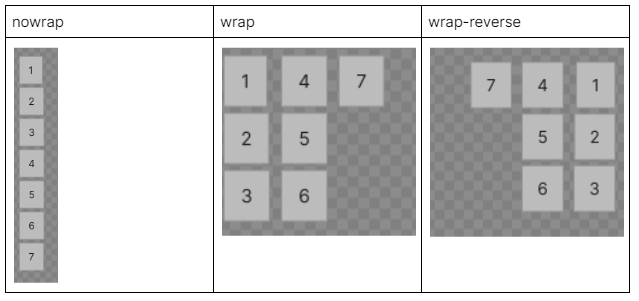
- Wrap: Determine which elements don’t fit and ignore them, otherwise go up or under previous elements.

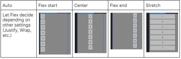
- Align Items: Pack the elements on selected positions using their minimum size.

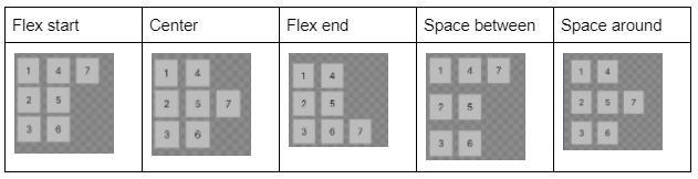
- Justify Content: Determine the spacing between elements along the main axis.

For more information on Visual Element positioning, see the UI Toolkit Layout Engine documentation.
Styling
Styling is where UI Toolkit exhibits its full power. Adding Style to visual elements is done via USS files (Assets > Create > UI Toolkit > StyleSheet). They are the Unity equivalent to web CSS files, and use the same rule-based format.
Note that user-made USS files are not mandatory for the UI to work. Runtime and Editor Styles are provided by default, but creating custom USS enables you to expand on what’s already provided or even create styling from scratch.
You can add Style selectors through the UI Builder Inspector StyleSheet panel and then edit them using code or UI Builder.

USS Style selectors in UI Builder

Matching added Class on the Inspector
In the above screenshot, the .RedButton selector is added to a button. The selector thus appears alongside the built-in .unity-text-element and .unity-button classes that all buttons automatically have.
Below is an example of a USS rule that sets the background color of all elements with the .RedButton Class to red. The first line of the rule is a selector using Class name followed by a list of Styles to apply.
.RedButton { background-color: red; }Just like in CSS, classes can be combined to further restrict the scope of a rule’s selector:
.RedButton.BlueText { color: blue; }In this example, only objects with both the .RedButton and .BlueText classes will have blue text. When combined with the previous snippet, the button will also have a red background.
Like CSS Styles, USS files can be used to override the appearance of objects based on their state:
.unity-button:hover { background-color: red; }In this example, all buttons that are in the hover state will have their background switched to red. To preview hover styling and see what the effects look like, click Preview in the UI Builder toolbar.

In-depth example
Now that we know the basics of UI Toolkit, let’s build an example that compares creating interfaces using UGUI vs UI Toolkit. Our goal is to build a simple menu, including mouse hover with the following two effects:
- Change in background color of the buttons
- Change in text color of the buttons

To create this menu with UGUI, set up the following hierarchy:

We also need to add a few extra components to some objects:
- Menu has an image for the background and needs anchoring for alignment.
- Buttons must be anchored correctly so that they are properly aligned.
- Restart and Quit buttons require:
- A script to dynamically change their text color on hover.
- Button component settings (edited in-Editor) to change the background color.
In this example, Quit is a Prefab defining a red button.
Now, to create the menu with UI Builder, start with a similar hierarchy:

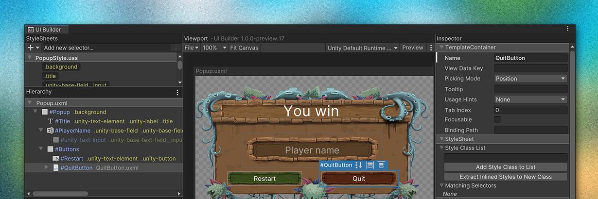
With Popup Align set as Center, and Buttons Flex Direction set as Row, our current UI Toolkit pop-up looks like this:

Note that the Quit button is red, as it’s using the component QuitButton.uxml, an equivalent to the Quit button Prefab.
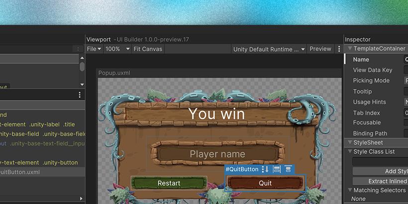
To see where the UI Toolkit magic truly happens, add a PopupStyle.uss with a bunch of rules and…

.background {
   background-image: url('/Assets/Assets/OptionsMenu.png#OptionsMenu');
   width: 500px;
   height: 300px;
}

.title {
   font-size: 32px;
   color: rgb(255, 255, 255);
}

.unity-base-field__input {
   background-color: rgba(0, 0, 0, 0);
   background-image: url('/Assets/Assets/OptionsMenu9Slice.png#OptionsMenu9Slice_2');
   width: 300px;
   height: 75px;
   font-size: 20px;
   color: rgba(255, 255, 255, 0.5);
   -unity-text-align: middle-center;
}

.unity-button {
   color: white;
   background-color: rgba(0, 0, 0, 0);
   background-image: url('/Assets/Assets/StartMenu.png#StartMenu_ButtonDefault');
   width: 160px;
   height: 30px;
   -unity-slice-bottom: 1;
}

.unity-button:hover {
   color: rgb(0, 21, 255);
}

#Restart {
   -unity-background-image-tint-color: rgb(112, 202, 125);
}

Please note that there’s selector precedence in place here. For example, a style written directly into the UXML will override the one in the USS files. Here, the width and height of the elements are added to PopupStyle.uss, but they could also be edited directly in UI Builder, and override the PopupStyle.uss. The precedence rules can be found here.
So let’s say we want to change all the colors that appear in the menu, but not in the rest of the game: UGUI would require us to manually edit all of the colors for all components, one at a time. Consider our example, however. While only the Quit button is a Prefab, we could make them all Prefabs, so to override them once locally. Then, as they are edited, any future color change in the Prefab would be ignored by the menu.
With UI Toolkit, we only need to create a NewStyle.uss duplicating the PopupStyle.uss tags, and replace PopupStyle.uss with NewStyle.uss.
Adding UI to the scene
Once the UXML file is created and styled, the last step is to add it to the actual scene. To do this, replace the Scene Canvas element and create an empty GameObject with a UI Document element. Fill it with the popup.uxml and Panel Settings files, and press play to test the new UI.

Try UI Toolkit today
Once you’ve had a chance to try UI Toolkit, please let us know what you think on the UI forums, or check out the official documentation for further details.
Finally, you can follow the latest updates by visiting our new Unity Platform Roadmap. Please share your feedback directly with the product team – we look forward to hearing from you!
This article is written by Marina Joffrineau on the Accelerate Solutions team, made up of Unity’s most senior software developers. The Accelerate Solutions team offers consulting and custom development solutions for game studios of all sizes. To learn more about Unity Accelerate Solutions and how we can help you achieve your goals, visit our website.
Is this article helpful for you?
Thank you for your feedback!
- Unity Labs
- Copyright © 2024 Unity Technologies