2D art creation in Dragon Crashers


Jarek Majewski is the freelance 2D artist and coder who created the art and animations for our latest 2D sample project, Dragon Crashers. Talking with Eduardo from the Unity 2D team, Jarek opened up about his creative process, tips for creating sprites, 2D lighting and animations, and using Affinity Designer and Photo, his art and design software of choice.
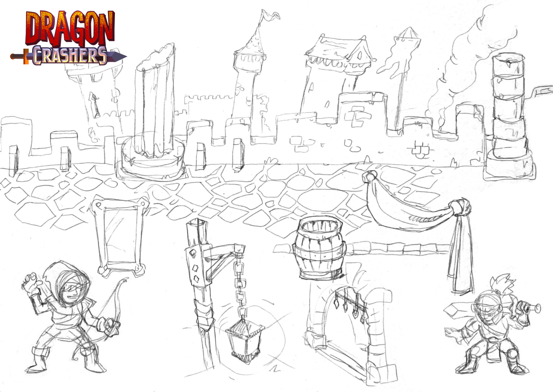
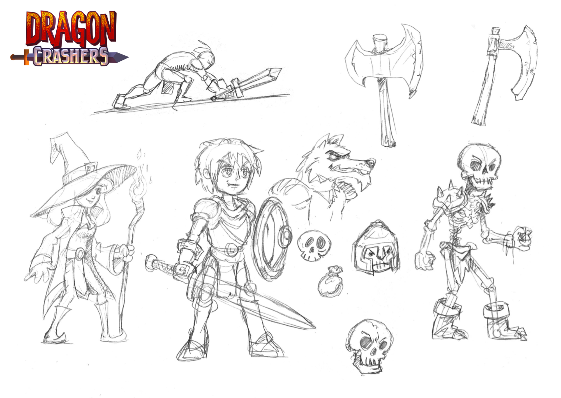
I start with a pencil and paper
I’ve been drawing since I was a child. I wanted to use my imagination to create worlds, stories, and characters. Then I discovered video games and was mesmerized. I combined my passion for art with that for video games.
There’s a simplicity to using a pencil that allows me to visualize my thoughts with minimal effort. I don’t need to prepare anything, launch any software, or choose a tool or color to paint – it’s a perfect mind-art connection.

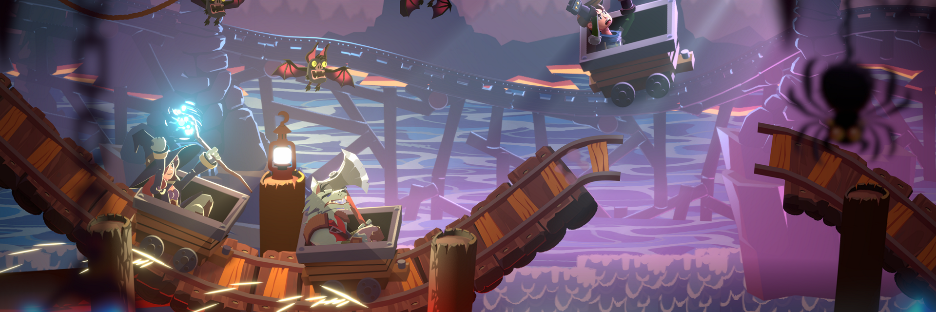
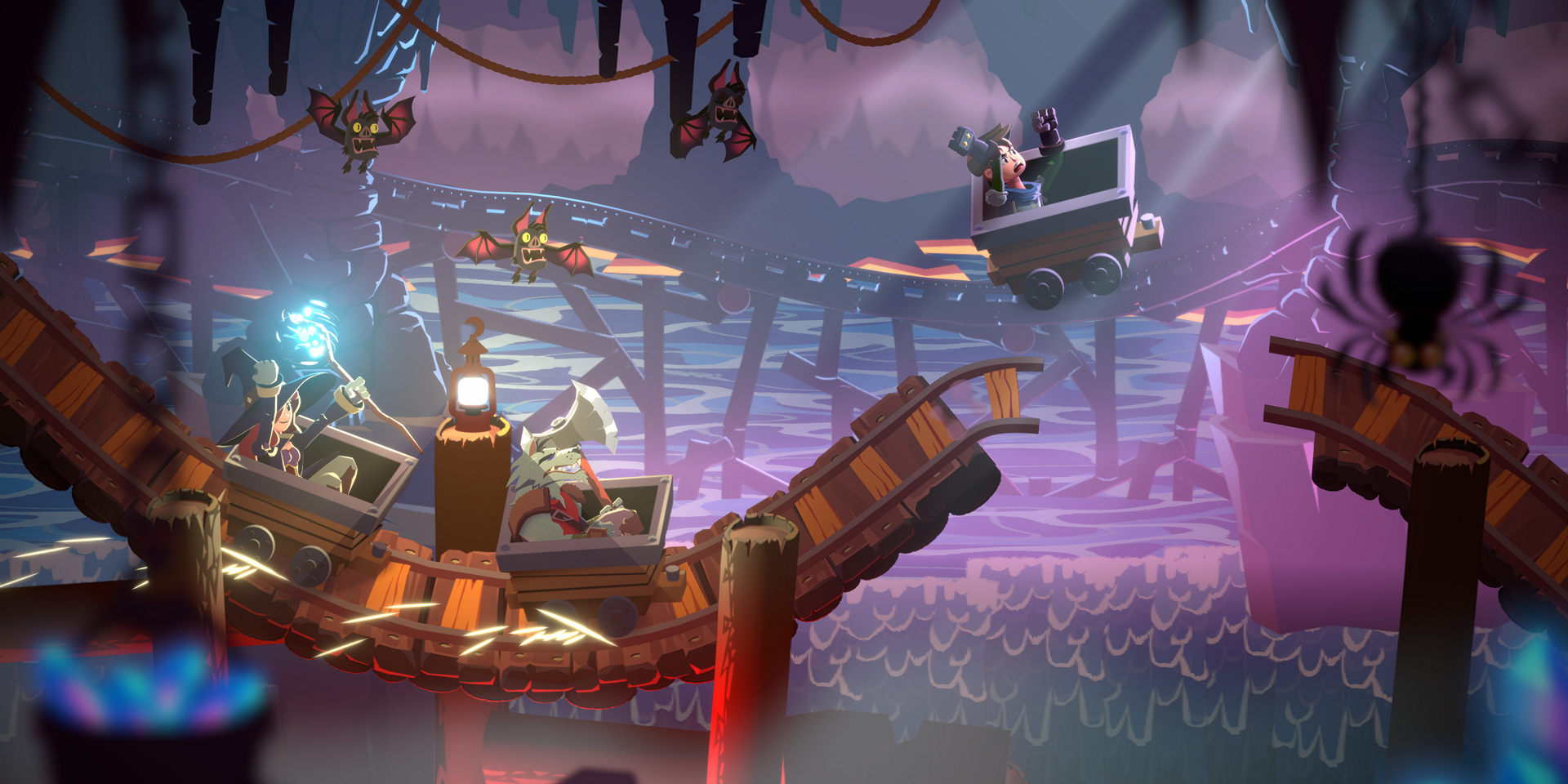
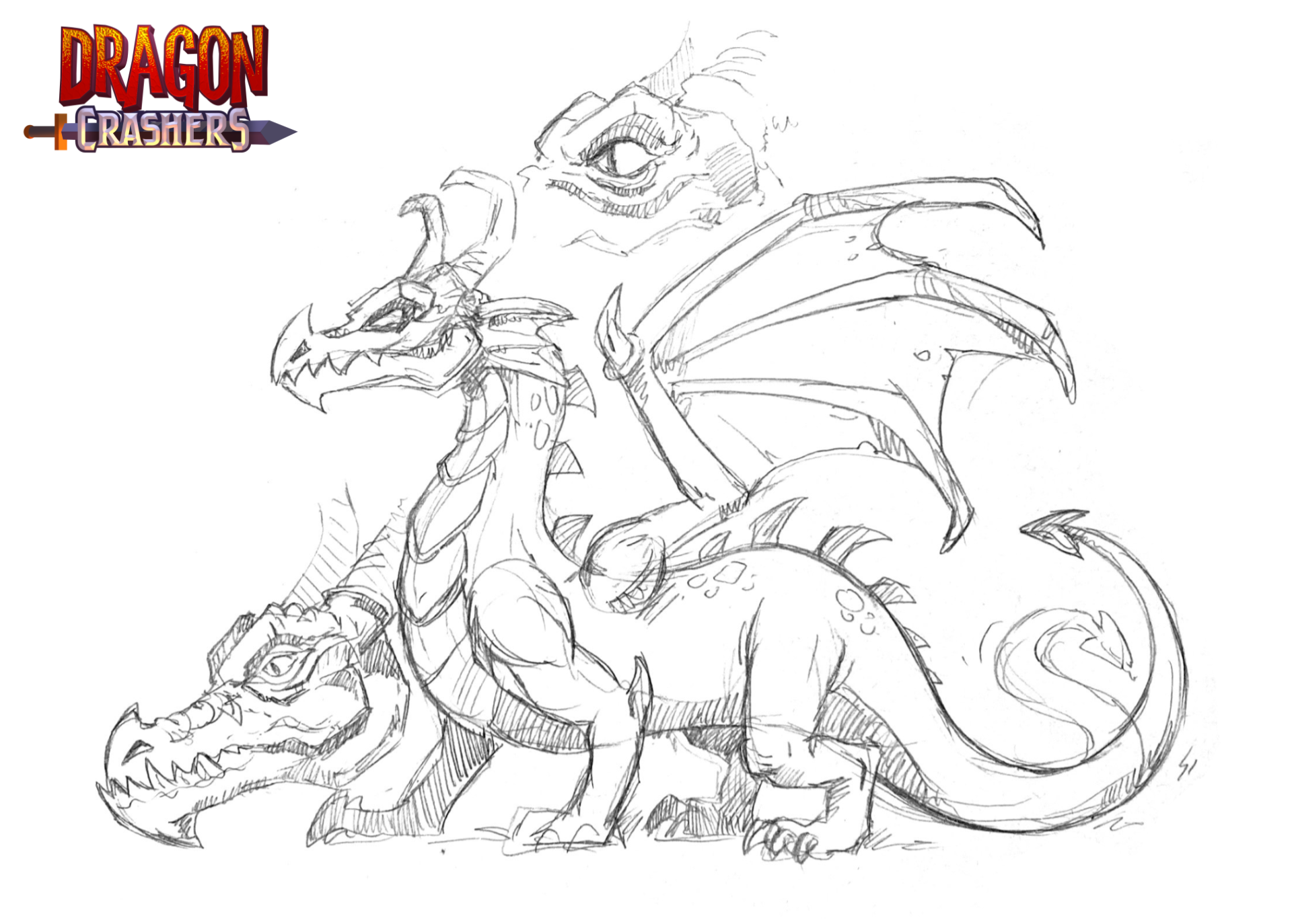
The dragon was not my first idea for Dragon Crashers

I had other concepts inspired by Journey to the Center of Earth, Castle Siege, or a pirate ship. My last-minute proposal was of a crystal mine with a dragon sleeping on a pile of gold. The demo team ultimately chose this as the concept for the project.
It’s a great choice to showcase Unity’s capabilities, such as Sprite Shape, which was used to create the mine tracks, and 2D lights. We have a diverse cast of bipedal and four-legged characters that show sprite rigging capabilities. It’s a perfect scenario to tie together the story, art, and technology.
How I create a sprite
I start by researching actual images of the sprites I want to create, because even stylized art needs to be believable.
If you’re creating the first sprite for a new game, you can create multiple variants to eventually find the right art style. But if it’s a sprite for a game with an established style, you need the environment in which to place the sprite as a point of reference. This helps you to choose the correct proportions, color palette, and viewing angle (this is important when making a game with a camera angle pointed slightly upward and at an angle, such as a top-down isometric view).
If your art uses outlines you’ll need to make sure the outline width matches that of the other objects in the environment. It’s also important for pixel art: If you make a sprite that doesn’t match the game palette you can change it, but if the pixel size is off that requires redoing it from scratch.

Once you have your sketch and an environment in which to place the sprite, you can start making the sprite.
I start with simple shapes or silhouettes and then fill in the details. I use mostly vector graphics because they’re flexible and easy to edit. I can edit colors and shapes, or scale my sprite without losing quality.

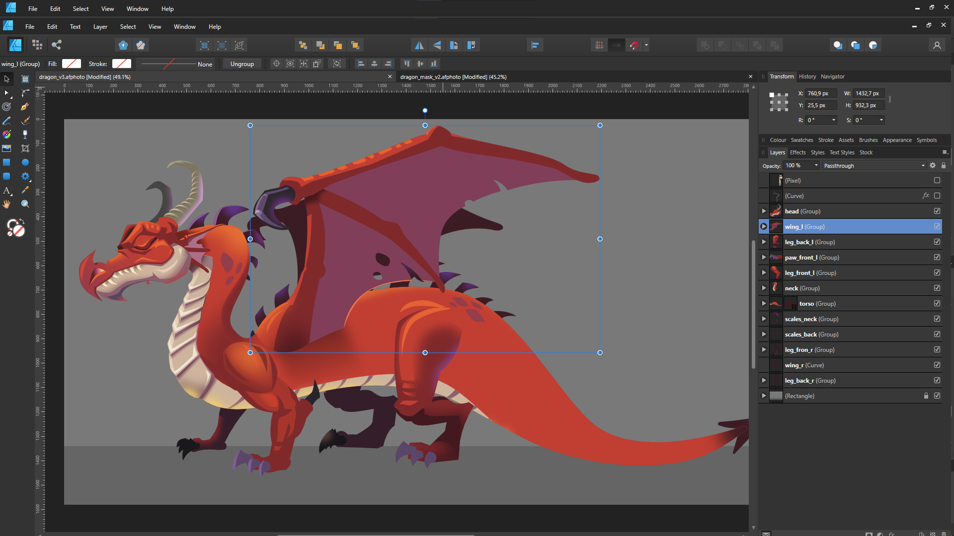
I like to have every sprite in the most editable form, whether it’s raster- or vector-based. So I use as many layers as I can without sacrificing performance. It’s important that I can always go back to my original file to change some parts or colors to create a different sprite.
I flatten my sprite layers only when exporting to PNG format. I mostly use the Export Persona feature in Affinity Designer for exporting. It allows me to have one file with every sprite and export all of them with a single click. I can also choose the Continuous mode when exporting, so the sprite will be automatically exported when I change anything on it. It’s a huge time saver.
Creating normal maps for your sprites
A good normal map can make or break the illusion of a sprite being 3D. Every pixel in a normal map stores data about the angles of the main texture. The red, green, and blue (RGB) channels store angle data for the X, Y and Z coordinates. Let’s look at how the RGB values affect the angles of the normal map.

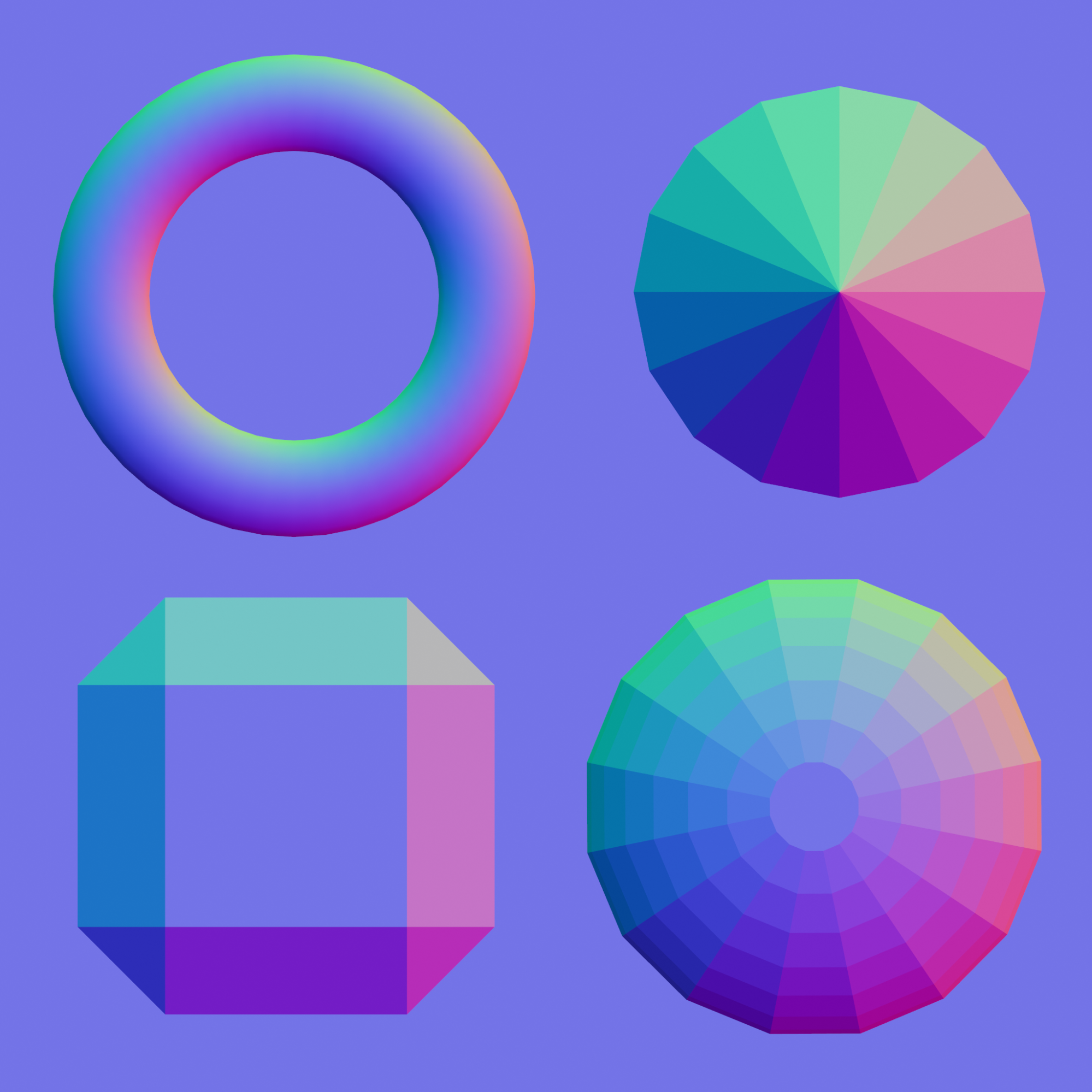
The above image is of a flat normal map in which the pixels are facing the camera. Its RGB values are 127, 127, and 255, respectively. Each color channel can have a value from 0 to 255, so 127 is near the middle. If I want my surface to face left (-90 degrees), I need to set the R color value to 0. If I want it to face right, I set R to 255. If I want it to face straight down or up, I set the G channel to 0 or 255 respectively.
One way to paint a normal map is to make drawings of your sprite lit from different angles and combine them into one texture. The sprite will be lit with one light from the right in the R channel and one light from the top in the G channel. In the B channel the sprite is lit from the front, but for the sake of simplicity you can omit this channel with 2D sprites.
However, this approach can be time-consuming, as you will need to paint your shaders at least twice.
Another approach is to use a normal map-generator app. You can open a sprite in a generator app, and with just a couple of clicks it generates a normal map. Generator apps do not take into account the angles of your sprite, so avoid using them on the entire sprite. Use it instead to generate normal maps of sections of a sprite that are beveled, such as chains, cables, or a dragon’s tail. Import a section into the normal map generator, tweak the values, export, and then add the necessary parts and details yourself.
The technique I used to make normal maps for the sprites in Dragon Crashers was to paint the colors directly on the sprites. Before I explain this technique, I want to note something about the base-color sprite. If you plan to use 2D lighting extensively in your game and want to make the most of the normal maps, don’t paint the light and shadow onto your sprite.
2D lighting doesn’t look good on a sprite that already has shadows painted on. You will end up doing double the amount of work because you’ll be painting the lighting in the normal maps. You can paint some non-directional shadows (ambient occlusion) and your sprite will look better, but it’s better to avoid any directional light, such as from the sun.

How to paint normal maps onto sprites
To paint the normal map, you need to know which colors to use for different angles. For Dragon Crashers, I did this by referencing normal map palettes online. I then made one for myself in Blender and exported it as a .PNG file. The palette is a simple sphere; I picked the angle color I needed and painted it on. I mostly used vectors by making a shape and filling it in. You can also paint the colors with your brush of choice as you normally do on your drawings, or paint it pixel by pixel for your pixel art.
Angle colors don’t need to be 100% accurate; a few degrees won’t make a difference. However, keep the overall shape of the sprite believable. If you use an angle color that doesn’t make sense in context, the whole shape will fall apart when lit.
Painting normal maps can be tricky at the beginning because it requires good spatial imagination. Start with simple shapes like boxes or barrels to understand how to do it correctly, and in time you’ll master this technique.
A couple of shortcuts to note: When there’s a spherical shape, you can paste the normal sphere from your palette. When you have a cylindrical shape, you can take a part of the sphere, paste and stretch it.
Be aware that when you copy and paste parts of normal maps and then rotate them, it breaks the shading. But this can also be used to your advantage. For example, when you need a concave spherical shape, you can rotate the sphere 180 degrees to create a hole.
Choose the method of generating normal maps that’s best for you. You will most likely have to make many assets for your game, so focus on the objects that will be visible most of the time and simplify other parts of the game. Choose the technique that will give you the best results for the least effort. Some tools that can help include:
Normal Painter Krita’s Tangent brush Sprite Illuminator Laigter Sprite Lamp
Animating the characters in Dragon Crashers
I always plan out my animations ahead of time to pinpoint what I want to achieve within the constraints I’m working in.
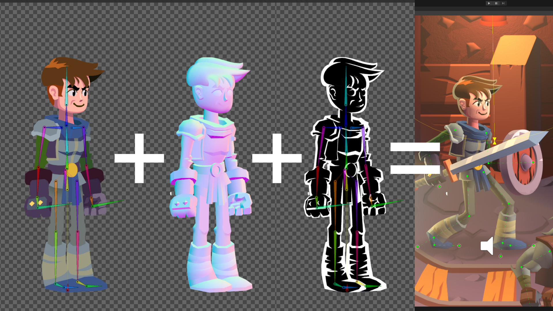
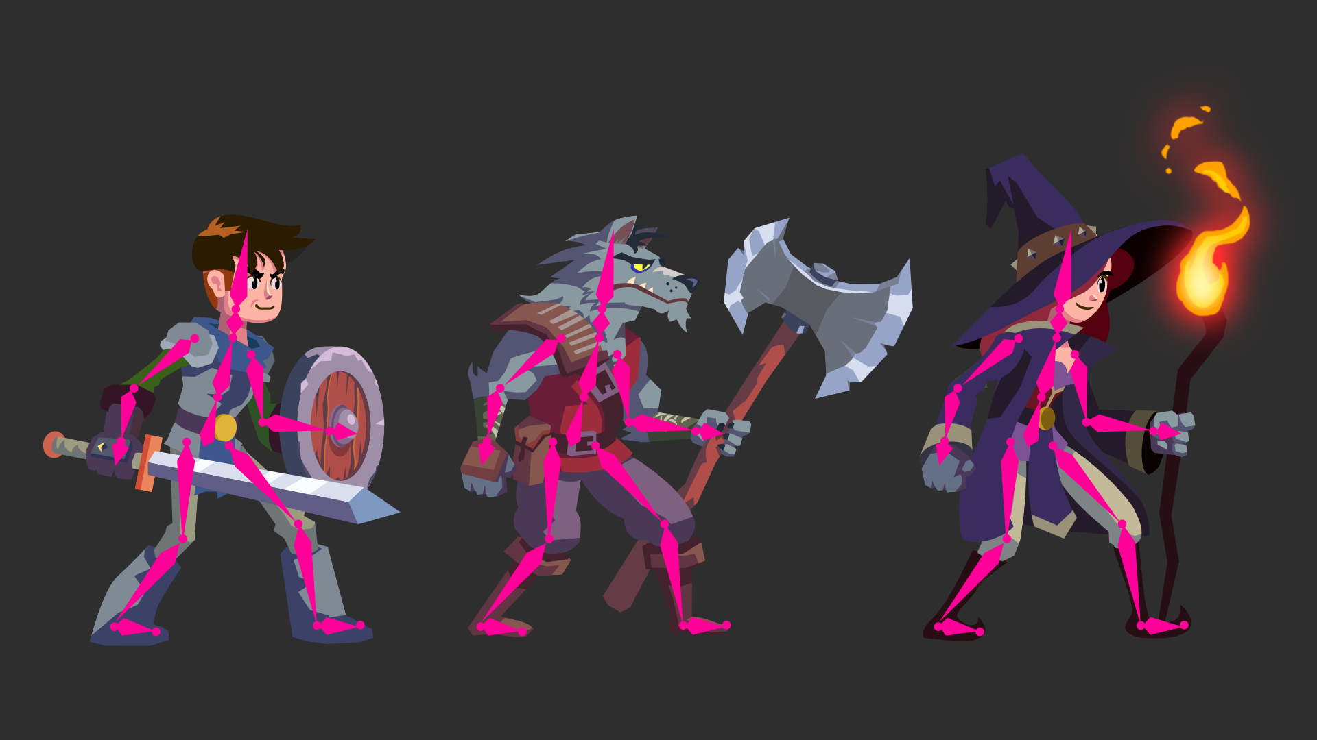
For Dragon Crashers, I chose good proportions for the first characters and used this as a base for the others. I focused on three bipedal player characters and one enemy (let’s leave the dragon for now). All of these characters used the same sprite-skinning skeleton to take advantage of the Sprite Swap feature (currently in experimental mode) that comes with the Unity 2D Animation package. At the same time, each character needed its own distinct visual style to avoid looking like a simple reskin.
To design the characters, I had to make sure that all of them could use the same skeleton, so I made a simple skeleton overlay in Affinity. That way, I could check whether a character’s limbs match the underlying bone structure. It turned out pretty well, and the characters are unique-looking: One has broad shoulders, one has bigger feet, and another a wolf’s head.
A lot of planning went into choosing how many layers the characters needed and which bones would affect each layer because changing these elements later would cause a headache. Of course, there was some trial and error involved, but with the base character planned well, all of the other characters were easier to make.
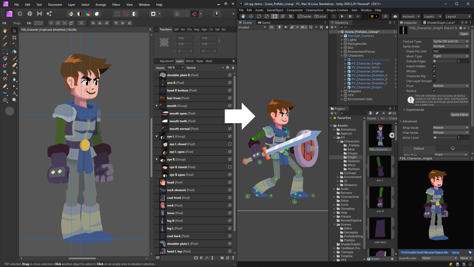
To import the characters into Unity, I used the PSD Importer because it allows me to have the same layer structure and positions as in Affinity. I designed my characters using vectors, so each layer consisted of a number of paths. To import a character into Unity, I had to rasterize each layer and export the file as PSD (and change the file extension to PSB). So I had two files for each character sprite: One was a source vector, and the other a rasterized version. This allowed me to have an editable file in case I wanted to make some tweaks to the character.
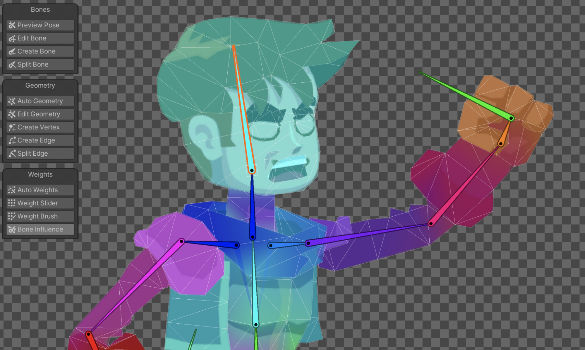
After importing the PSB file into Unity, I rigged the character in the Skinning Editor. I made all the bones, auto-generated meshes for each of the layers, and used the Auto Weights feature to bind the bones.
I optimized the character rig, first by cleaning up the meshes to make them use as few vertices as possible, and then cleaning the bone weights to make sure the character looks good in every pose. I double-checked the places where the joints bend, such as the ankles, knees, and elbows. I carefully placed the mesh points and their weights in these places so the bending of the limbs looks believable.

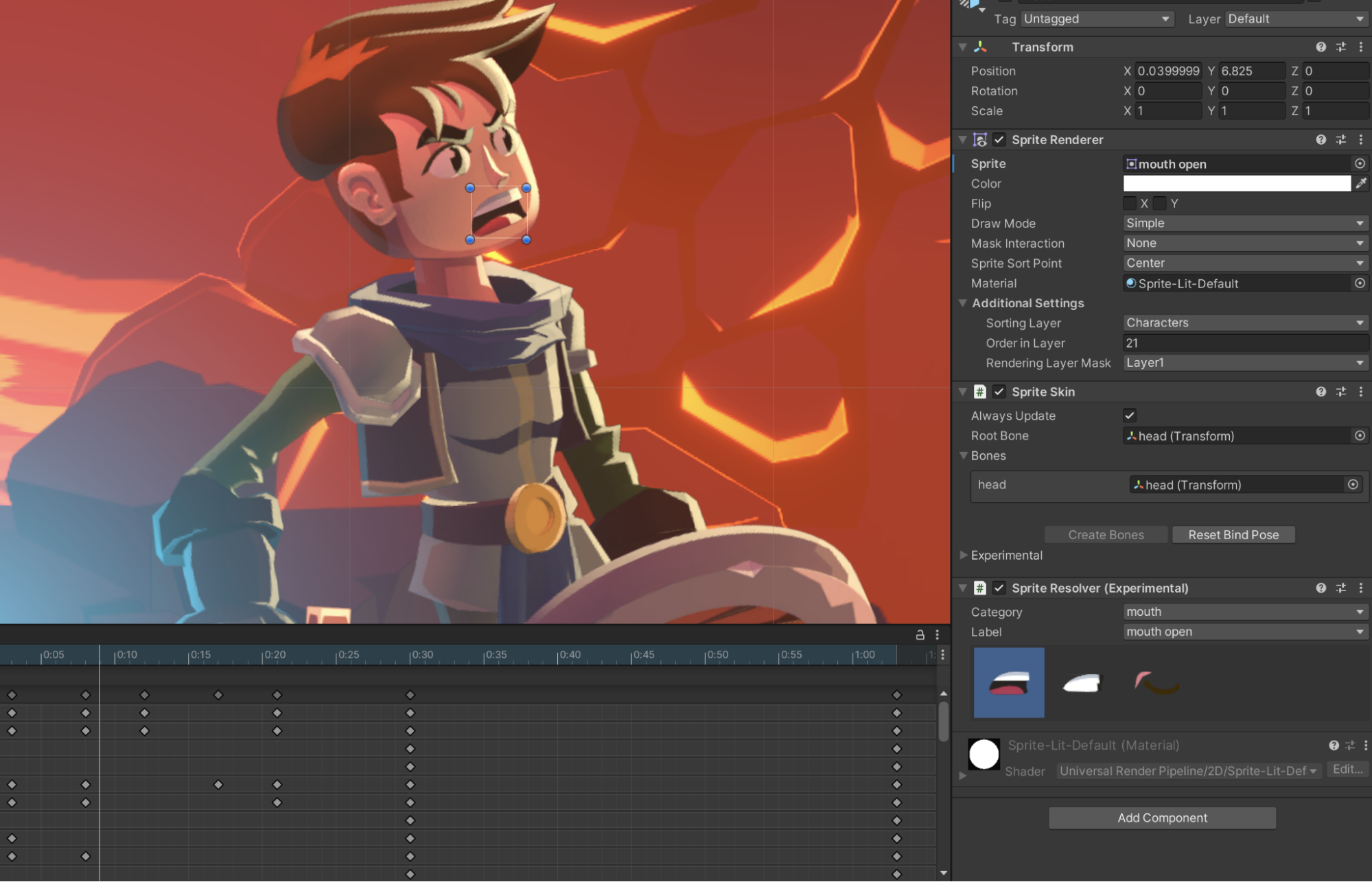
After the rigging process, I made a Sprite Library Asset, which groups multiple sprites into Categories and unique Label names. This enables me to make other characters by just swapping this Sprite Library Asset for another one. I also added Sprite Swap for the eyes and mouth to create facial expressions, then I added 2D IKs to the character limbs to give me better control when animating the character.

After these steps, I made my character a Prefab so the changes made to it would apply to other characters. I could make tweaks to IKs, change sorting layers, add some weapons or attachments, or attach some scripts to the base Prefab, and these changes then applied automatically to the other characters. This saves a huge amount of time if you have many characters.
For other characters, I imported the PSB file as before, but this time I didn’t need to make the skeleton. I simply copied it from the base character and tweaked the topology and weights of the sprite meshes to fit the new character’s shape.
Importing normal maps and mask maps was even easier. I copied the character into Unity by using the shortcut Ctrl + D (Cmd + D on Mac), opened it in Affinity, and replaced all the layers with their normal map (or mask map) counterparts. As the normal map isn’t a color texture, I had to uncheck the RGB option under Advanced > Sprite Import Settings. Now I could assign the normal maps and mask maps as Secondary Textures in the Sprite Editor.
The characters were now animation-ready, and they could share the same set of animations. I used the same animation clips for most of the actions but gave each character its own personality by crafting for each of them unique versions of idle and attack animations.
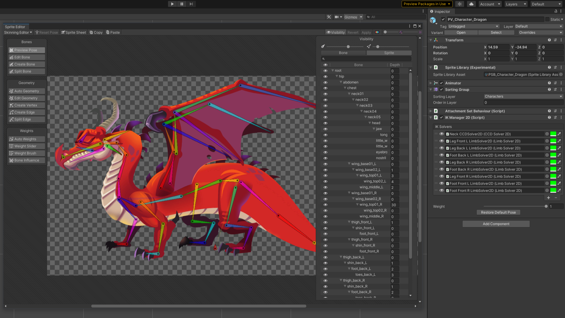
The workflow for animating the dragon was more straightforward. It didn’t need to have custom skins so there was no extensive planning involved. I could focus on design and rigging. A lot of time went into making sure that the wings, tail, and neck were rigged correctly and without visual artifacts when animating. It’s always good practice to test extreme poses when rigging, as it will save headaches later on.
The process of setting the Sprite Swap, IKs, and additional maps was roughly the same as for the bipedal characters. Not counting the two extra legs.
Assembling the final environment in Unity
The first thing I need is a vision of the environment I want to create. The mood and general flow of the environment are clear in my mind before I start – the visuals, gameplay, and emotions. Details can always change later, but a foundational vision allows me to focus on what I want to achieve rather than placing Prefabs randomly.
I start by exporting the assets for the environment to Unity to make the Prefabs. Once I have all the pieces in the Scene, I can go wild. Unity doesn’t restrict me to any particular workflow; I can start painting with Tilemap as a base, add sprite tiling on top with Sprite Shape, place sprites by hand, add lighting and effects, such as fog or particles. Again, because I already have a clear idea of the layout of the level, I can focus on visuals.
There’s also the gameplay-first approach, designing the flow of the level. With this approach, it’s good to focus on the geometry of the main interactive layer by placing all the platforms, walls, and rooms first. Add interactive elements, such as enemies, obstacles, and pickups, then test the level and iterate as required.
Overall, a good practice is to separate the interactive layer from the visual elements. This approach will save you a lot of time and work; figure out the core gameplay first and then add the visuals. This way you don’t need to redo all the carefully placed flourishes when you (or the level designer) want to redo the gameplay.
My favorite Unity features while working on Dragon Crashers
The features’ integration with one another makes it easy to set up sprites and secondary maps, and they just work as they should with other features like normal sprites, Tilemaps, the sprite shader, and Shader Graph.
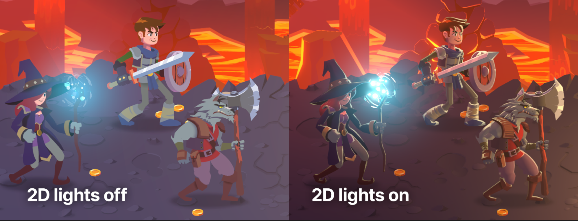
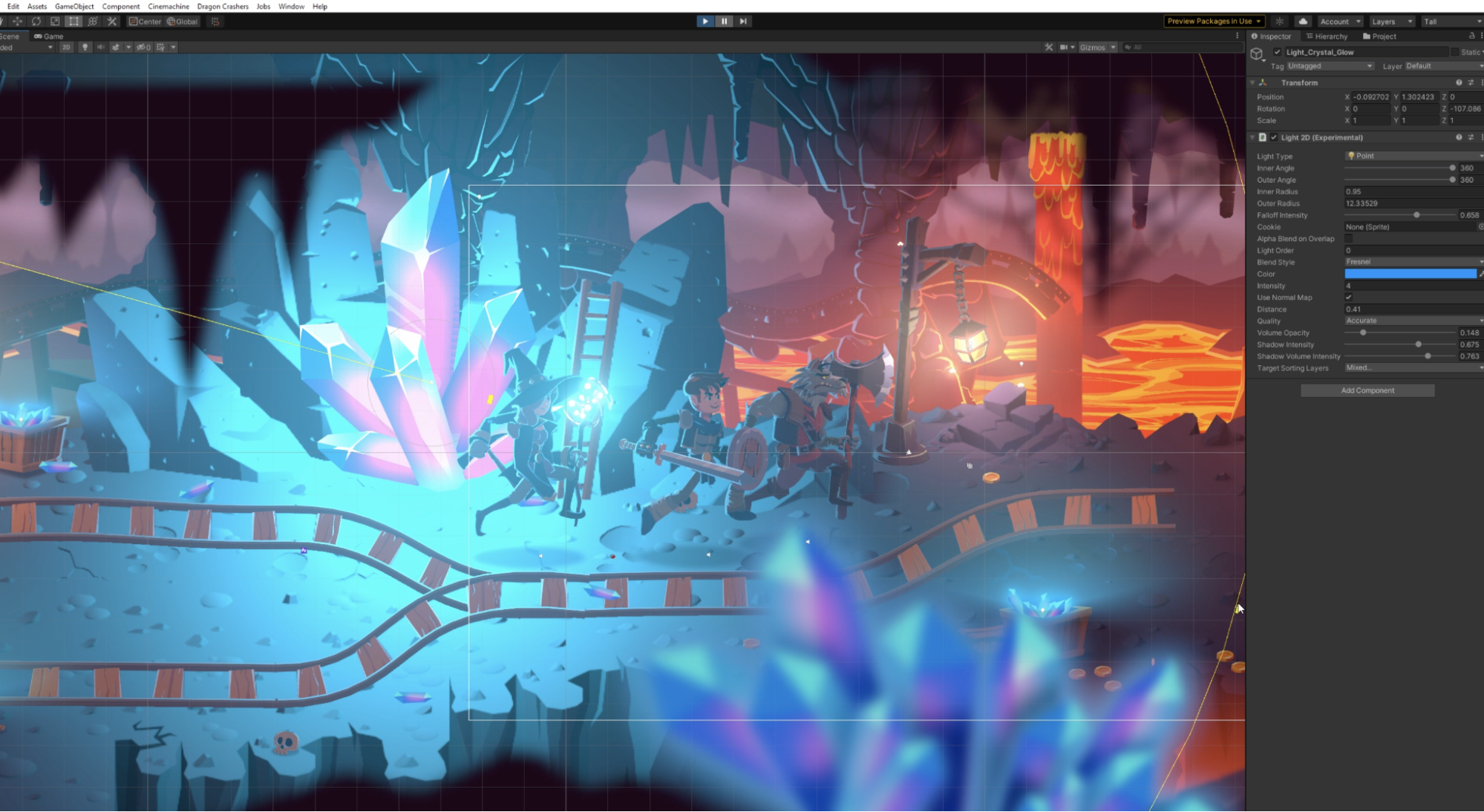
2D lighting
One great workflow is 2D lighting and mask maps in conjunction with 2D rigging. It’s a similar workflow to what you would use to set up a 3D environment. I made a simple unlit sprite, normal map, and mask map for rim lighting, and I didn’t need to repaint the asset to match the environment and lighting conditions. The sprite is lit just like it was painted. It looks hand-painted and it fits the game environment.

It’s a game changer. You can even make marketing assets with this setup. You can reuse your game environment, place the characters, set up the lights, and it looks incredible. You don’t need to make poses for different characters, paint the light and shadows, etc. And on top of that, you can add some post-processing effects to change the scene’s mood.
In particular, I love the way I could use 2D lights to add shadows. When the setting Use Alpha Blend on Overlap is applied on a 2D light and the light intensity is very low, the light starts to shade the environment and acts as a shadow area. I used it to make the shadow below the dragon.
Sprite Shape
I can’t imagine making a 2D game without Sprite Shape. It’s very easy to set up and edit. You can have a level in a matter of minutes, so it’s good for rapid prototyping. It’s not just for making level geometry. I used it to make mine tracks, bridges, hanging ropes, background scaffolding and foreground shapes.
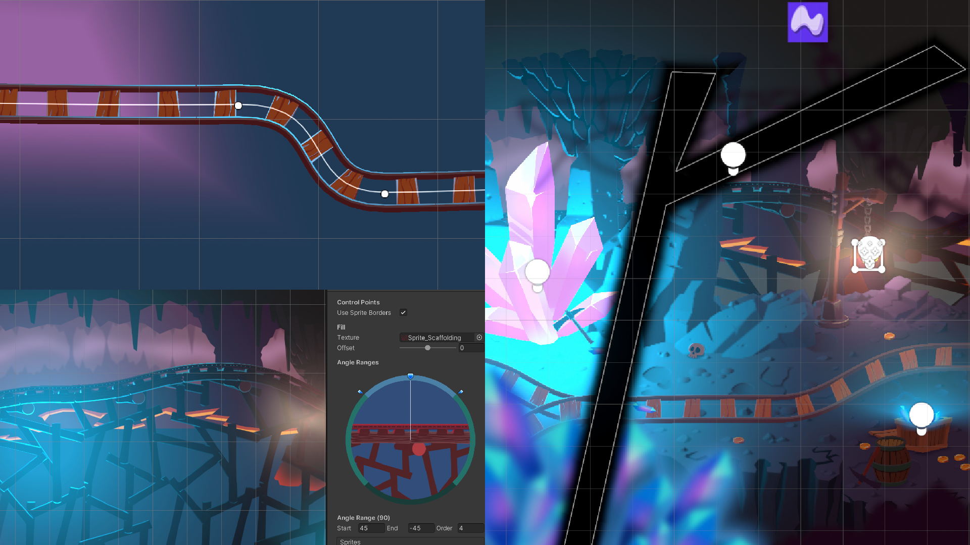
In Dragon Crashers, to fake the blur (which is expensive on mobile devices) I used a blurred edge texture. The use of Sprite Shape is only limited by your imagination. It takes just a few seconds to edit a shape, which is a great time-saver when you need to tweak your environment. I like how you can make sharp geometric shapes or use Continuous Mirrored Point Mode to make them more rounded. Sprite Shape also generates 2D Colliders saving you time on setting them up manually.
If you haven’t used Sprite Shape, try it soon to see how it can improve your workflow.
Timeline
Andy Touch (a senior content developer at Unity) made almost all of the systems in Dragon Crashers with Timeline. This made the creation process seamless: I could hop on and make some small changes to any of the timelines without breaking anything. I love how modular the system is and how easy it is to edit a cutscene or any other gameplay element based on Timeline. And nesting timelines in each other made the whole process even more efficient.
Affinity Designer tips and tricks
Affinity Designer is available for use on Mac, Windows, and the iPad. It supports vector and raster workflows and tools for 2D game artists.
The Pen feature in Designer has many useful shortcuts that will help you make any shape you want without switching to another tool. Start with the shortcuts that are displayed at the bottom of the Designer window.
Make your art as editable as possible. The editable Compound feature will help with this. Normally when you want to combine paths, they will become one solid path without the capability for future editing. Click on one of the geometry buttons on the toolbar and at the same time hold down Alt (or Option for Mac users) and the Compound path will form a group, but every layer will have an option on how it interacts with the other layers. You can choose between Add, Intersect, Subtract, and X modes. It’s very handy!
Use the Document color palette. These are colors that are set globally for your document. Any object that uses the given color will update when you change the color in the palette. It’s handy for creating variations of objects and characters.
The above image shows a blue-colored warrior character. His armor legs, arms, helmet, and weapon are all blue. Let’s say you want to change his color to green. By using a document color on every part you can change the color from the swatches palette and instantly have a different character.
Use Symbols. Often you will have many duplicate objects placed around your canvas, such as level tiles or bricks. But what if you want to change all of the duplicated objects? You can use Symbols. Create one object and turn it into a Symbol. Then duplicate it. Whenever we change something in one of the Symbols, the others will change too.
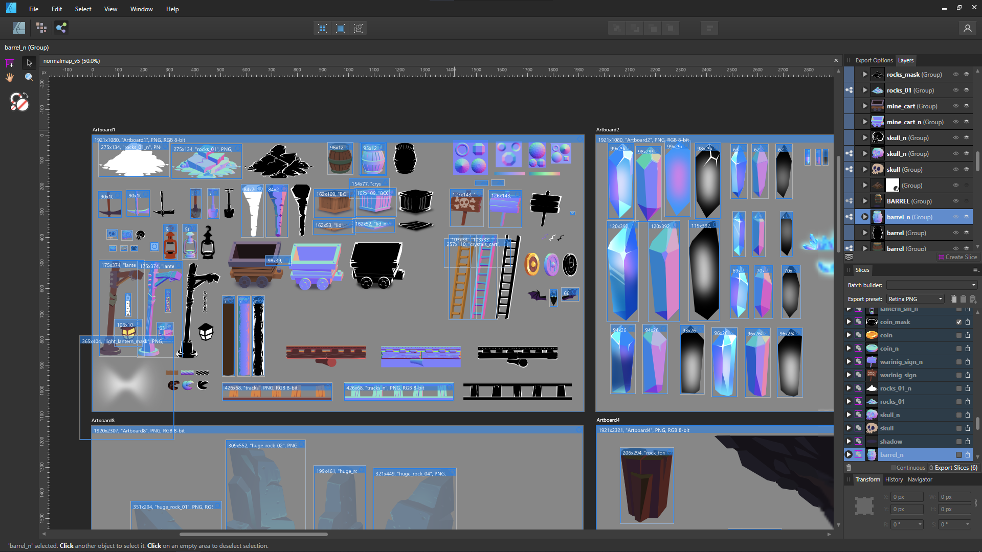
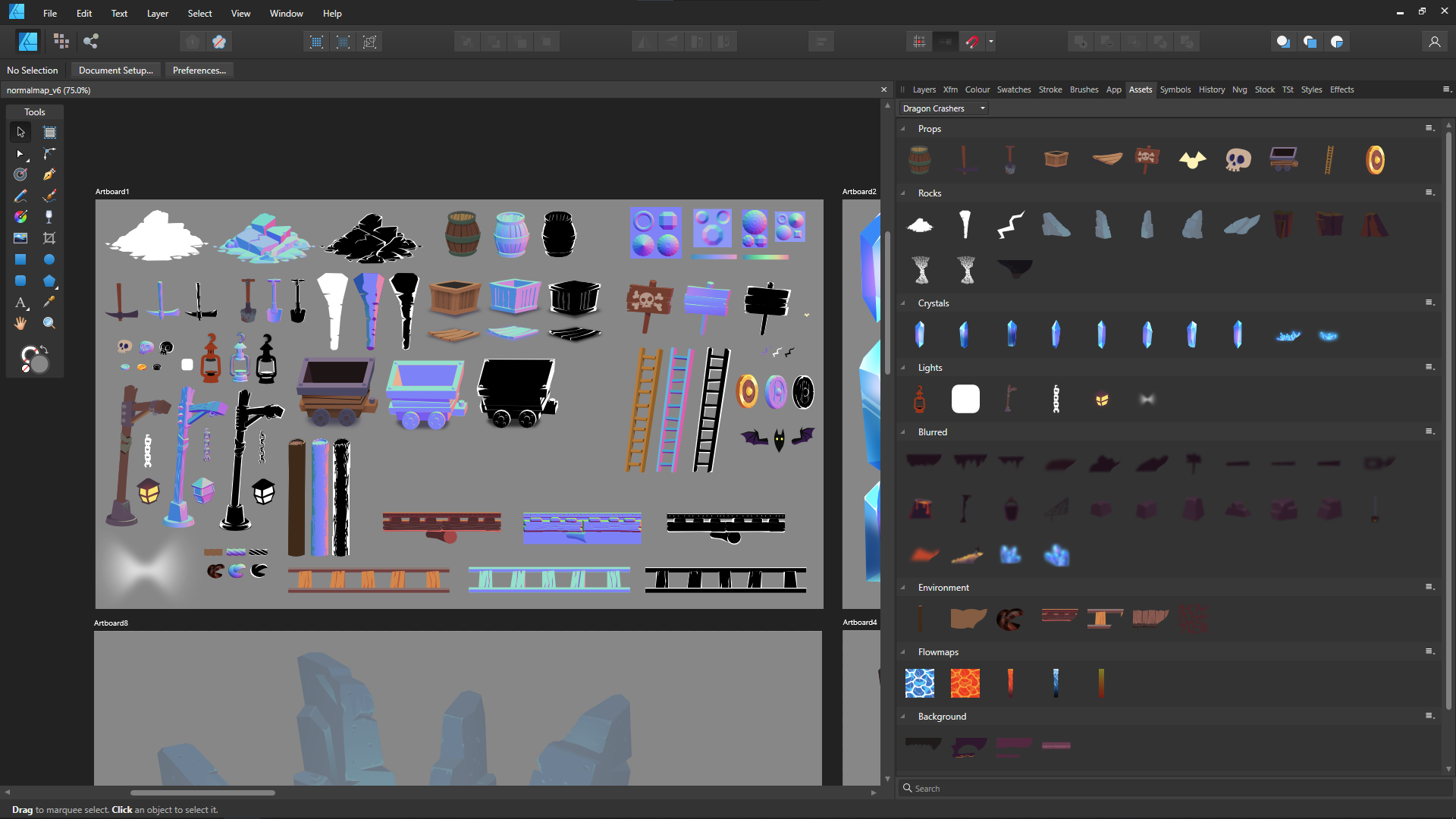
Organize with the Assets panel. Place all of your objects in this panel, and you’ll get an overview of all the things in the game in one place. You can group them by any criteria you want: the level that the object is used on, type, color, etc. Then you can drag and drop these objects to any document you have open. You can check for visual consistency, scale, how they appear in another level, and so on. You can also make mockup screens or “screenshots” of your game.
Furthermore, you can store UI elements in the Assets panel like button designs, switches, and icons, and use them when designing your game’s interface.
Tips for Affinity Photo
Affinity Photo is a full-suite photo editing solution available for macOS, Windows, and iOS.
The suite of Affinity apps is set up to be used interchangeably: You can open your document in either Designer or Photo, no matter which app you saved it in first. You can switch between them by using the menu command File – Edit in Designer (or File – Open in Photo).
Both apps share most features; Asset Panel and some vector features are available in Affinity Photo as well. The interfaces are similar making it fast to switch between the two.
The most important feature in any raster app is the brush feature. Affinity Photo has a brush engine that’s very fluid and provides all the needed functions, such as table support. You can also export and import your own brushes. I love the stroke stabilization option: When you turn it on your brush lines become very clean, which is good for making outlines.
In addition to the great raster graphics and brushes, a major feature I like to use is the Live Filters. They allow you to dramatically change the look of your art without losing editability. I love the perspective filter in particular because it enables you to deform layers to match the perspective which is useful for placing windows on buildings, posters on walls, or textures on surfaces. With Live filters, you also get Live Adjustments Layers and Blend Modes, features that enable you to see results instantly.
Finally, I like Layer Effects, which enables you to add gradients, drop and inner shadows, outlines, 3D effects, and more. With a bit of creativity, you can achieve almost anything with them and they’re also non-destructive.
Thanks to Jarek for taking the time to share his tips on 2D art, Unity, and Affinity Designer and Photo. If you are new to Unity, learn more about Unity’s 2D toolset here.
Is this article helpful for you?
Thank you for your feedback!
- Unity Labs
- Copyright © 2024 Unity Technologies